Marketing Website
Shipped a mobile-friendly website with benefit-oriented messaging and search-friendly content for a new Cisco productivity app.
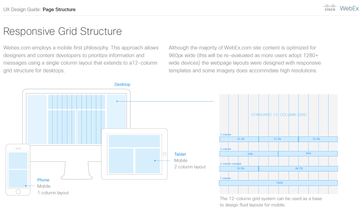
Businesses’ first fully responsive website framework
- Defined Cisco Webex design standards
- Paths to download the app for any device
- Led the vision through launch
Project Overview
The business needed to promote a new technology tool for small- and medium-sized businesses, with a goal of creating a tailored marketing experience targeting a specific audience—knowledge workers. The existing Cisco Webex marketing website, however, was built for a broad audience, and its content framework was neither scalable nor suitable for the new product launch.
Lead UX Designer
Business Leads, Visual and Interaction Designers, Content Writers, Developers
Challenge
The challenge was to design an experience that served as a landing site for targeted users to learn about the new product, see its value and download the app. The business needed a microsite that would engage early adopting users familiar with mobile software tools so it was important that the website had a hyper-focused messages and the site was accessible and usable from any device and screen size like the product app.
Launching a new product in the market was a unique opportunity for the marketing team. The business had not defined a particular process in the past so they looked to the design team to lead the project team through a creative process that would help them to create a solution.
Research
Document and share examples of engaging user-centric website design.
I began by researching examples of product websites. How did other businesses promote new products online? What design methods or techniques did they use to effectively promote their products?
After browsing other websites for B2C and B2B products, I discovered user-centered patterns that were similar across the different online experiences. Sites that were most appealing effectively told a story visually within seconds and some time with lifestyle imagery that complimented the messaging across the site.
Research Findings
Each website example had a clear and prominent call to action at the top or center of webpages to buy or try the product. Navigation menus often took minimal real estate which helped to focus website users’ attention on specific tasks.- Browsed B2C and B2B product sites
- Visual storytelling, lifestyle imagery
- Clear call to actions
- Clear value propositions
Brainstorm
Explored innovative ideas based on research findings and team feedback.
My research inspired my initial ideas for brainstorming. Like the example sites I researched, the product marketing site needed to appeal to the user and most of all it needed to be functional—designed for primary tasks that could be performed on multiple devices.
Home Page Exploration
The home page is always one of the most important webpages of a website since it is a common entry point for users’ primary websites tasks.
Brainstorm
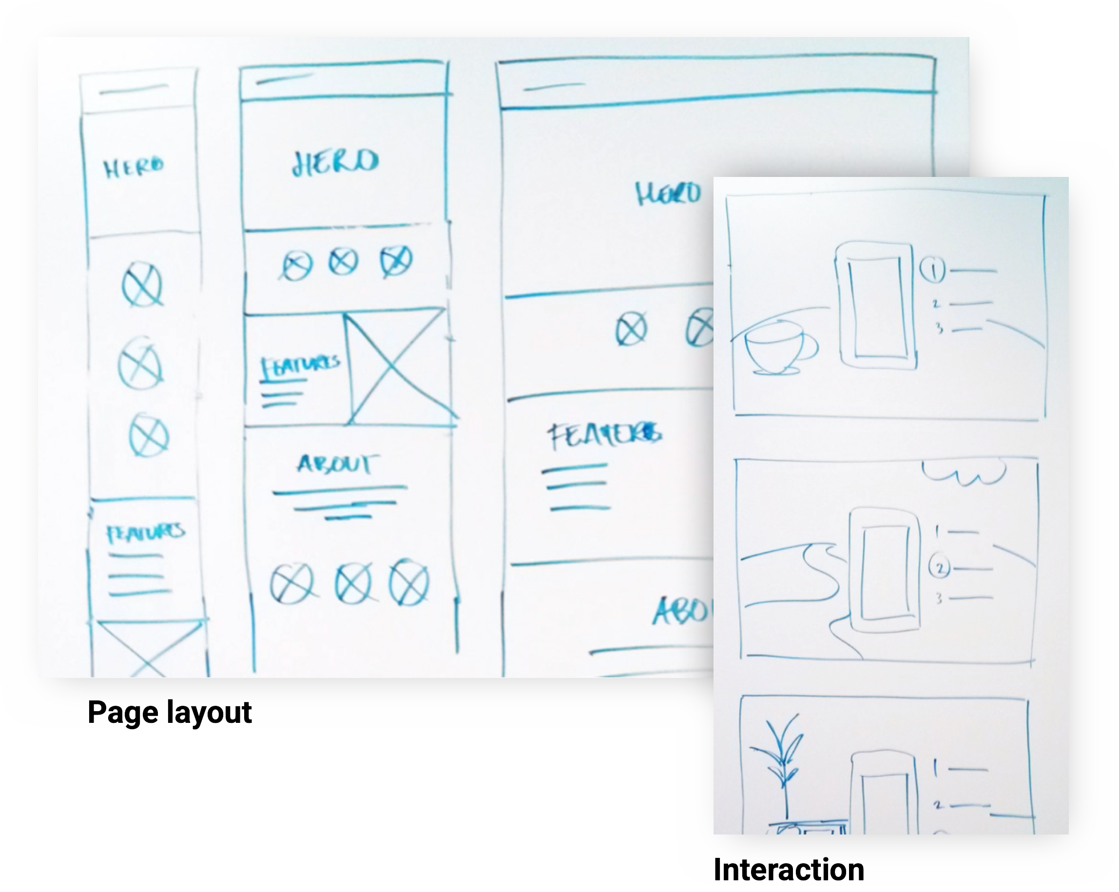
I sketched a home page hero concept concept to communicate a visual storytelling idea using motion graphics.- Sketched vision for early discussion
- Helped writers/visual designers
- Flexible content for different contexts
- Designed for multiple screen sizes
Design
Ideate early concepts and design an experience based on the user needs and goals.
While I brainstormed and explored ideas for elements of the website, I began sketching concepts for a responsive layout. I needed to define a framework that incorporated visual elements and messages into a single experience that work across phone, tablet and desktop devices.
My layout sketches were instrumental in early discussions with the content team because it helped writers in addition to visual designers to develop content that worked in different contexts whether users were browsing the website on a phone, tablet or desktop computer.
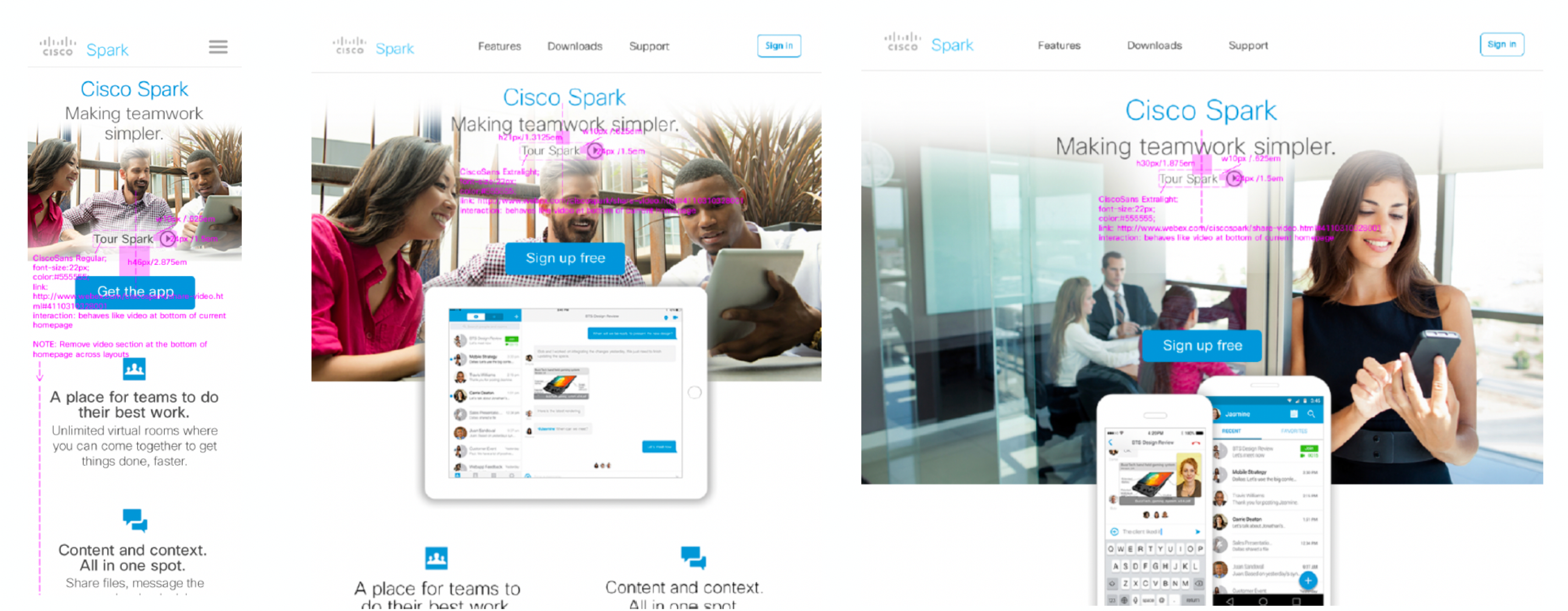
I worked closely with the development team to design download buttons with logic that allowed each call to action button adapt to the user’s device.
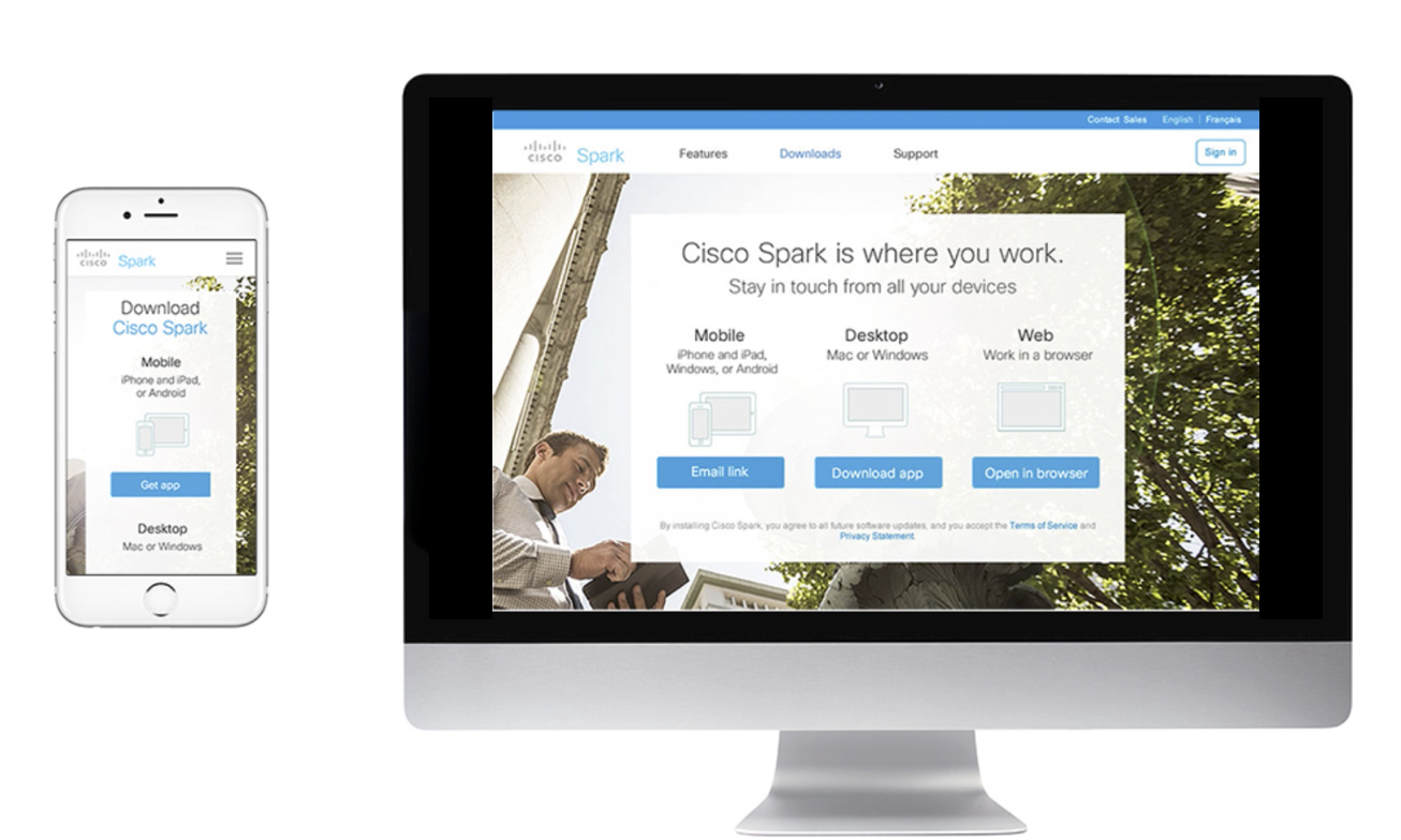
Download Page Smart Buttons
If users viewed the mobile app download button from a phone, the button call to action is “Get app” and its link triggers an action to the download app.
If users view the same mobile app download button from a desktop, the button call to action is “Email link” and its link triggers an interface to email a download app link to a phone or other device.
Launch
An Innovative Product Website
I led a cross-functional team including designers, writers and other project stakeholders through a creative process to design and launch an innovative website for Cisco’s newest innovative productivity app. Together, our team learned how to push the boundaries of the latest technology in web development to create a user-centered experience that allowed users to learn about a product app and download it.
Design Deliverables
- Led the vision through launch
- Hands-on design specifications
- 1st fully responsive site
Contribution to Design Guidelines
The project was also an opportunity to define and document guidelines to design future mobile-friendly webpages. I worked with visual, interaction designers and developers to define standards for layouts, components, imagery and other content.